Discover the creative story behind our Craft issue, which features its very first illustrated cover – a hyperreal image of Switzerland’s Monte Rosa Hut – along with a rich, floral sleeve and a standalone SUITCASE travel guide to the edgiest Swiss cities.
13 June, 2022
Anyone,
you might argue, can come up with a creative concept.
What counts is how you execute it. Which is why, when the SUITCASE
team landed on the idea of producing three standalone editorial
elements that work together for its summer 2022 issue, we turned to
talented Swiss illustrators Nina Schwarz, Anita Dettwiler and Dani
Pelagatti to help us bring them to life.
What made this crew so perfect for volume 37 of SUITCASE was not
just their diverse design skills but their heritage: with a strong
Swiss theme running through the issue, it was important to us that
we lean into their understanding of the content while showcasing
the skills of graphic artists who are craftspeople in their own
right.
Long-time collaborators Schwarz and Dettwiler met while studying
scientific illustration at Zurich University of the Arts. Dettwiler
and Pelagatti have since set up their own studio – Bunterhund
Illustration – and have worked together with Schwarz on
numerous projects.
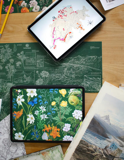
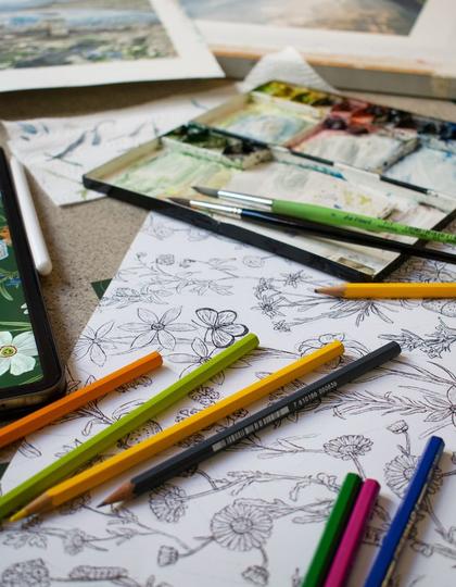
Work in progress; the inital stages of the project being
formulated.
Initially, there was the magazine to consider, with its
first-ever illustrated cover, and for which we commissioned a
highly detailed artwork from the trio, strongly bedded in realism
and in step with the SUITCASE style – evoking landscape, travel and
the human story behind both. Enter our stunning, hyperreal
illustration of Monte Rosa Hut, created for our cover and to
accompany our feature on Switzerland’s iconic mountain shelters.
In tandem with the Craft issue, we also celebrate the artistic
side of this spectacular nation with A Creative’s Guide to
Switzerland, an 80-page SUITCASE travel companion to Zurich,
Geneva, Lausanne and Montreux Riviera, and Basel. For
this, we opted for a change of pace from the main magazine, hence
the deceptively simple line drawing that employs a little artistic
licence to fuse together the Matterhorn and two of the country’s
most iconic buildings.
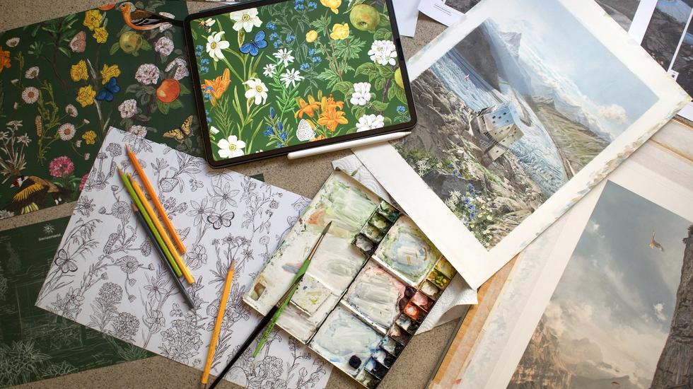
Finally, to wrap the two publications together, we wanted to
create a splash, achieved through a lavishly illustrated sleeve
depicting a vibrant mass of Swiss alpine flowers on the outside,
and then highlighting the craft and creativity that has gone into
the whole project, with a sketchbook of notes and drawings on the
magazine cover story on the inside.
The Craft issue with A Creative’s Guide to Switzerland and
our specially illustrated sleeve is available online in
the UK, to subscribers and in London newsagents while
stocks last.
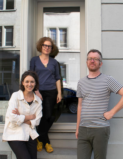
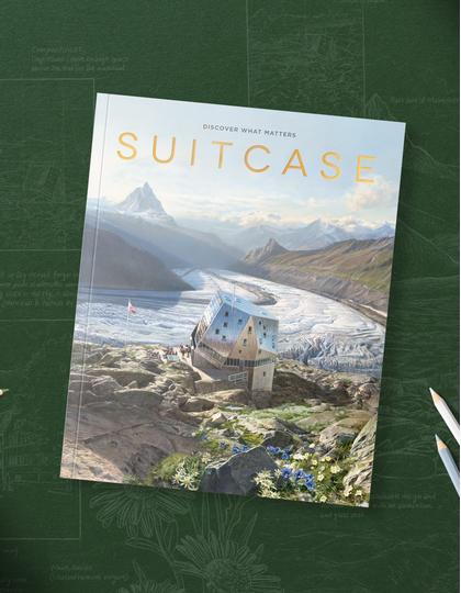
The illustration team behind the cover, Nina Schwarz (left),
Anita Dettwiler and Dani Pelagatti, and the final design for
SUITCASE Volume 37: Craft.
Nina: A design process as intricate as this
requires several steps before the outcome is finalised. Initially,
we started with a hand-drawn sketch that was solely based around
the issue theme, then, in collaboration with the SUITCASE design
team, we were able to mould the style to align with the content.
Wildlife and nature is woven throughout the sleeve and cover, but
before we could consider adding details we had to marry the
appropriate colour palette and typography style.
Anita: After exploring the SUITCASE narrative,
we came to analyse past issue covers and what the key factors were
in making them individual. Representing the geographical location
of the Monte Rosa Hut in Zermatt was challenging – we had to
research images and videos in order to best understand what readers
would find if they visited. After drafting outcomes based upon
different weather conditions and seasons, we were able to present a
wide range of composition drafts to the design team… Several
revisions and conversations later, the cover was complete.
A: Throughout the entire process, we [Anita and
her colleague Dani] worked closely with Nina, first discussing the
style of what the internal sleeve could look like before creating
the different sketches. This allowed us to best understand how the
botanical style would embed alongside the rugged landscape. In
terms of initial sketches, we knew when planning the cover that the
sleeve would feature hand-drawn illustrations, so we had always
planned the drafts to be a usable asset.
N: The collaboration itself was a huge success.
While it was a group effort, there were many individual roles that
were divided in a fresh and fulfilling way. Working with other
creatives always adds value; the shared exchanges inspired and
helped the project to unfold in a positive way. Anita and I had
also worked together professionally prior to this, so there was a
natural comfort and understanding in our conversations.
A: I personally relish the opportunity to work
alongside others; learning different perspectives and enriching a
piece through a multitude of opinions is always healthy. It’s
important to be aware of your own strengths and weaknesses when
entering any project. In this instance, having a dynamic that
welcomed individual power points allowed the project to thrive.
N: The project consisting of various layers was
an enticing prospect for me. Aside from having the opportunity to
work with the fabulous Anita and Dani, the brief was so beautifully
curated, I felt desperate to get started immediately!
A: SUITCASE is a publication that is known for
both its storytelling and beautiful photography, so the opportunity
to be a part of its first illustrated cover was something that I
couldn’t pass up. Illustration opens a whole window of new
possibilities and I’m delighted to have been a part of that.
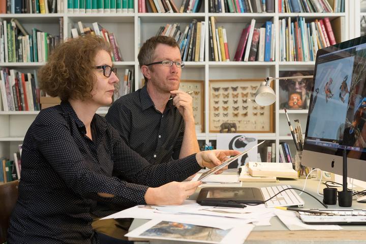
The duo behind Bunterhund Illustration at work.
N: The plants and insects are from Switzerland,
most of which are from the alpine region. The natural world can be
somewhat overwhelming, so I followed botanist Andreas Honegger’s
publications as a guide. As well as nailing the accuracy of the
content, there was of course the aesthetic aspect, which ultimately
was the deciding factor in what plants and creatures would work
well together. The ultimate goal was to create a coherent and
harmonious overall picture that gives an insight into the exquisite
flora of Switzerland.
A: It makes a difference if you know the
destination or at least the region. The power of holding that
knowledge translates through the light, contrast and texture of the
material. Those that have sketched or painted the jagged peaks of
Zermatt before will understand how truly difficult it is to reflect
the impressiveness and splendour in one small frame.
Discover more stories from the Craft issue here.
